Pages

Wednesday, April 30, 2014

Long Lost Cousin to Responsive Design (Game Programming)

In my recent post on Responsive Design, at http://firefoxosgaming.blogspot.com/2014/04/responsive-design-game-programming.html, I noted the interesting problems with the Software Home button and how that robbed precious screen real estate from the ZTE Open. The same issues apply to other phones, but the ZTE is especially important because the screen is small.

Software Home Button

To refresh your memory, here is the ZTE Open with no Software Home button.


And here is the same ZTE Open with the Software Home button:


50 pixels lost!

André Jaenisch did some digging and discovered that this is documented on MDN.  Thank you, André!

MDN programming at https://developer.mozilla.org/en-US/Firefox_OS/Platform/Gaia/Gaia_apps/System#The_software_home_button says to use this CSS to detect and display the Software Home button:
@media not all and (-moz-physical-home-button) {
  #screen:not(.software-button-disabled) > #windows > .appWindow {
    bottom: 5rem;
  }
 }
And mentions the ability to set this in the Developer Settings here at https://developer.mozilla.org/en-US/Firefox_OS/Debugging/Developer_settings#Enable_software_home_button.

I never noticed this but somewhere when I upgraded my ZTE Open from 1.0 to 1.2, the Software Home button was enabled and I noticed it.

This button will turn out to be important when tablets for Firefox OS become available.

You don't need to worry about this, but if you want to, you can always put in that extra bit of CSS. In any case, make sure you actually detect what your screen size is and act accordingly.

Upgrading the ZTE Open to 1.3 or 1.4

By the way, if you have a ZTE Open, André also dug up some links on how to upgrade the ZTE Open to Firefox OS version 1.3 or 1.4. Again, thank you, André!

Upgrade to Firefox OS 1.3 at http://www.gizbeat.com/4223/how-to-build-firefox-os-1-3-2/.

Upgrade to Firefox OS 1.3 at http://blog.chellinsky.net/putting-firefox-os-v1-4-on-a-zte-open/.

Viewing Screen Sizes

I actually forgot to put in the code of how to generate the numbers you see in the screen shots above. Start out with the code from my latest CSS Shell code (adapt if you're using Canvas or SVG) at http://firefoxosgaming.blogspot.com/2014/03/son-of-css-shell-game-programming.html.

First I added a bit to the body to give the information a place to display:

  <h3>Width</h3>
    <p id="ow">Outer Width</p>
    <p id="iw">Inner Width</p>
  <h3>Height</h3>
    <p id="oh">Outer Height</p>
    <p id="ih">Inner Height</p>

Then I added this code in the section that runs after the page is loaded:

      // Get height and width.
      ow.textContent =
        "Outer Width = " + window.outerWidth;
      iw.textContent =
        "Inner Width = " + window.innerWidth;
      oh.textContent =
        "Outer Height = " + window.outerHeight;
      ih.textContent =
        "Inner Height = " + window.innerHeight;


You can also put this into console.log format. The important thing is that you know the inner and outer width and height, so you can program accordingly, but in this case, also display it so you can see what you are dealing with when looking at various devices.

Tuesday, April 29, 2014

Color Puzzle (Game Review)

Sometimes there are games I like because I used to play them in some earlier time. Color Puzzle is one of those tames.

Harken back to those early days on the Internet, around 2005 or so. I was really in love with the new iGoogle home page. It not only helped me to collect all those links I needed, but had these cool things called widgets. You could plaster them all over your home page and get the latest weather, news, and games! One of those games was called Flood-It and it had a simple but appealing game play. You chose a color and tried to fill a block by flooding.

The game was by Lab Pixies. Alas, iGoogle is no more and according to Google, we don't need no stinkin' home pages. And Lab Pixies were bought up by Google and are now doing something cool for Google. Who knows what? You can still get Flood-it on Apple and Android at least, and now something similar to it for the Firefox OS Marketplace called Color Puzzle.

By the way, Flood-it was so interesting that some academic researchers wrote about it and you can study their research here: http://arxiv.org/abs/1001.4420. Interesting. But we're here to talk about Color Puzzle, which looks like this:

This screen shot was taken from my Geeksphone Peak and it might have been nice for the creator to fill in all that boring white space with some design or a distracting ad, or anything. White space isn't cool. Responsive game design hasn't come to Color Puzzle!

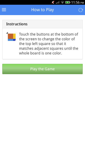
So the game is very simple. How simple? Here's the help screen for this game:


That's pretty exact and works well. A simple game, but that research paper I cited above is a 20 page PDF. Whew!

This game also has score boards so you can see how well you do against others. You get to those scores by clicking on the "hamburger" on the upper left. Yes, that's what the three bars are called (or was that hot dog? Or a trigram for the I Ching?)  Click on the three bars and you get these choices:


Interesting! The black menu on the left goes all the way to the bottom of the Geeksphone Peak, but looks fine on the ZTE Open. Responsive after all, but doesn't fill that white space.

You've already seen "How to Play" and here's what the "My Profile" looks like:


Wow! My first game and I got a score of 5,649,661. In fact, I'm ranked number 3496 in the world. Maybe I should become a professional Color Puzzle gamer. Well, maybe not, when I see that Nicole has a score of 46,010,683. 

But the screen continues:


 I got some badges. Scrolling down more:

And more badges!

When I go to the Leaderboard menu item, I see that I'll never be a player! Apparently the scores above are just current, perhaps for the day or week. Here's the real players:


OMG! A score of 1,186,632,207,378. Maybe they should use scientific notation! I bow down to Mustang Sally, the first trillionaire. Clearly this not only a game of skill, but also one of speed. 

So how do you play?

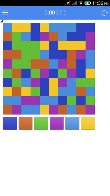
Here's is a typical screen:

You have six large squares at the bottom, each a different color. You start out by looking at the light blue square at the top left. You want it to expand, to flood, by picking the color it should change to. Your best choices are yellow or orange. If you pick orange, you get two squares for your first score. They will turn orange. But it you pick yellow, you'll have three squares and they will be yellow.

The strategy is to expand the number of blocks as much as you can with each move. So I picked yellow and got this screen:


The next step is obvious. Pick green! That way you will increase the number of blocks you "own" to eleven! Sometimes it is obvious, but like many other strategy games, sometimes you will choose a shorter gain for a longer gain, something that will take you to a big gain. 

I picked green.

What next?

I picked orange because there were four orange blocks touching the green. 

Now it looks like this:

 I'll skip the next several steps and show you what it looks like near the end:

Here we can see that the field is nearly flooded with dark blue. What to pick next? The answer is NOT purple. If you do that you can't flood the purple square in the lower right corner this turn. So the next move would be to flood something else and open up the purple corner. 

How about orange? Yes!


Now it doesn't matter. Pick purple and then green and the game is over! That's how I got my score, but I'm sure I wasn't fast and you can do a lot better. Maybe even take on Mustang Sally.

Here's my first score:

Actually my second, but I wiped the game and started over again so I could get better screen shots. You can see that the score is a factor of moves and time. I'm not sure how it is calculated, but maybe someone more mathematical than I can figure it out. My only math skills are Boolean.

Anyway, this game is just great and works as advertised. No music, a little too much white space, so this only gets a 4 out of 5, but it was close to a 5. Maybe a 4 because this isn't an original game and Lab Pixies got there first!

Cost: Free
Genre: Puzzle
Score: 4 (out of 5)
Tested on: ZTE Open and Geeksphone Peak
Get it at: Firefox Marketplace
Developer:  Catlin Software
https://marketplace.firefox.com/app/color-puzzle

Wednesday, April 23, 2014

Bouncing Ball in Construct 2 (Game Programming)

Construct 2 is a game-making engine. With a few clicks, you can make almost any kind of game and publish it in an amazing variety of platforms. At last count, you could create games for the following:

The Web (HTML5)
Wii U
iPhone
Android
Windows 8
Windows RT
Windows Phone 8
Windows Desktop
Mac Desktop
Linux Desktop
Blackberry 10
Tizen
Facebook
Chrome Web Store
Amazon Appstore

and

Firefox Marketplace!!!

And it does this with no coding required!

You can try it out yourself for free at http://www.scirra.com and see what you thing. If you like it, you can buy a personal copy for £79 ($119) or a business copy for £259 ($399). While that may seem high, it is a one-time fee and you only need to pay for a business license if you earn more than $5000 USD. That's cheaper than most other similar products (GameMaker and Stencyl).


That's the Construct 2 monster you see when you boot up the actual game engine. Construct 2 was started by two brilliant brothers in London named Ashley and Tom Gullen, and their web site and forum is the most helpful and fun place for people using their product!

I've used Construct 2 in the past and even put up a (lame) game in the Chrome Web Store called Tilt-A-Twirl at https://chrome.google.com/webstore/detail/tilt-a-twirl/klabggekijaanbjbakdimcdikdhihhdn for a contest. I like coding and I think that coding in HTML5 with JavaScript, CSS, SVG, and Canvas is a lot of fun.

Construct 2 started out as a game engine to create HTML5 games. But it has grown rapidly! I first took notice of them again when they provided an export for games on the Wii U. Right now you can buy a game made in Construct 2 in the Wii U eShop called Block Drop U, a cool game that's a cross between Jenga and Angry Birds. Writing games for Nintendo hasn't been easy, but now it is!

Then, I was happily surprised to see that Construct 2 then supported exporting to Firefox OS. So I thought I would try it out and I'm very pleased. I'll write some games and share them with you and if you have been held back because coding in HTML5 looks complicated, you might want to see how easy Construct 2 is for making a game you can put in the Firefox OS Marketplace!

In keeping with tradition, my first game will be bouncing a ball, similar to the way that I already did in previous posts.

Bouncing Balls

CSS
http://firefoxosgaming.blogspot.com/2013/10/bouncing-ball-in-css-game-programming.html

Canvas Arc
http://firefoxosgaming.blogspot.com/2013/10/bouncing-ball-with-canvas-arc-game.html

Canvas Bitmap
http://firefoxosgaming.blogspot.com/2013/11/canvas-bitmaps-and-requestanimationfram.html

SVG Body
http://firefoxosgaming.blogspot.com/2013/11/bouncing-svg-part-1-game-programming.html

SVG JavaScript
http://firefoxosgaming.blogspot.com/2013/11/bouncing-svg-part-2-game-programming.html

SVG DOM
http://firefoxosgaming.blogspot.com/2013/11/bouncing-svg-part-3-game-programming.html

Whew! Six ways to bounce a ball in HTML5, all working in a Firefox OS phone. And what a trip down memory lane for me!

But now I'll show you a much simpler way to bounce a ball in Firefox OS, and one that will even prepare all the files for you to submit to the store.

Getting Started

For this demo, you just need a simple ball. I redrew mine slightly, making it 32x32 with the ball being solid and the rest transparent.


I went with 32x32 because I wanted to experiment with grid sizes and that seems like a good place to start. The old one was 20x20. Pixels, not furlongs.

Next I booted up Construct 2. It looks like this:


I won't try to explain how the user interface works. There are lots of tutorials, but I'll just say that there are windows on either side and top and that the game board will be in the middle.

Here's what Construct 2 looks like when you start a new project:


When you start, you can choose from a ton of different projects, depending on the type of game you want to create. I just created a blank one.

The project consists of a Properties window on the left, a Projects window on the upper right, and a Quick Access tool bar at the top. The contents of these windows will change as you progress. In the middle is the Layout for your game.

The first thing to do is set up the main details of your game. In Construct 2, there are many ways to work with various windows, so I'll give you one way and you can find others. To get the project started, click on New project at the top of the Project window at the top right.

This will set up the main project Properties in the window on the left so you can fill in the main details. Here's what my details are:


The first block (About) is unique to each game. The ID is created from the website name but the rest is obvious. The important thing in the Settings is the size. I chose 320x448 because that is roughly the size of the ZTE Open and not much smaller than the Geeksphone Peak. I chose the defaults for the Configuration section except that I chose Letterbox scale for the Fullscreen in browser and Portrait. You can fiddle with the rest and it's all documented very well by Construct 2. Essentially I'm picking something that will fit on a Firefox OS Phone.

Next I wanted to set up the Layout (game board). I clicked on Layout 1 in the Project window on the right. The Properies window on the left changes to reflect this, and here is my Layout 1 properties. By the way, you can have more than one layout so you can have different levels. Each layout can have multiple layers. Here's mine:


This is pretty simple. All I changed was to make the layout the same size as the screen I defined for the Project view: 320x448. The Margins are just the space outside of the actual layout.

Next I turned on the grid. Having a grid to place objects is very handy. You can do that by clicking on the View tab at the top and then selecting a grid size like this:


Snapping and showing are good things and the size is 32x32 pixels.

Everything is set up to start adding art and making them objects. To add the ball, double-click on the center of the screen, which should be Layout 1. If you don't see Layout 1 highlighted in the tabs at the top, click on that to make the layout active. You can tell if the tab is active because you can see a little X in the right of the tab. 

Here's the tabs showing that Layout 1 is active:

 
And here's one showing that Layout 1 is not active. This demo doesn't use event sheets but they are cool once you get more complicated games with ... events!


So anyway, double-click on the layout sheet. You'll bring up an Insert New Object dialog.


Double-click Sprite. The window will disappear and you'll get a cross-hair. Click where you want the sprite to go on your layout. When you do, you'll get a new dialog saying Edit Image: Sprite.


Click on the little folder near the upper left to insert an image. I picked my old 20x20 ball.


You'll see at the bottom that it says 20 x 20 but I wanted it to be 32x32. So all I had to do was click on the Resize button near the top right (a two-headed arrow) and then resize it.


Easy! Just click on the red close button at the very top right and your ball will be on the board known as Layout 1.


Pretty cool. Huh? But that's not a game yet and not even a ball bouncing. For it to bounce, we need walls. Four of them.

So next you want to insert invisible walls. They will be at the four edge of the screen. Here's how I did it. 

I inserted an object like the ball, but this time I didn't give it any art. I did the wall on the right first. Once you create an object, you can resize it on the layout. So I dragged it over to the right edge so it looked like this:


 I dragged it so that the wall is on the right side. It's the light purple rectangle. The right edge of the wall is flush with the right edge of the layout, and the top and bottom match.

Then I dragged the left edge of the wall so it is flush with the right edge of the board so it looks like this:


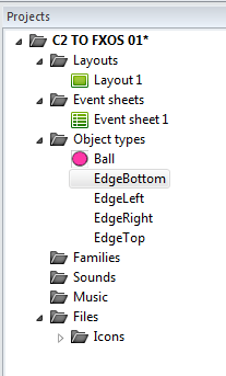
You can hardly see it, because now it is just a dark blue line with handles on the middle and ends. Handles are bits you use to drag an object. Be careful. Once you click elsewhere on the layout, the wall will vanish. But you can always see it again by clicking on the wall name in the Object types list of the Projects window. As you create each wall, you might want to give them names so you can identify them in the Projects window more easily. Create the other three walls, give them names, and then give the ball a name also, like "Ball". Your object list should look like this:


Object lists are great because you can see what objects you have, and by click on one in the list, that object will be highlighted on the board layout. Note that the Edges (walls) don't have an icon because they don't have art and are invisible.

Your objects are in place. Now you just need to set a few properties and your game is finished.

First let's set the properties of each wall. Click on one of the Edge objects. You'll see the properties on the left:


I didn't change anything here except to click on Add / edit Behaviors. This brings up the behavior dialog, which lets you define how objects ... behave!


In the screenshot above, I've already defined the one behavior you need for a wall. Solid! You get this by clicking on the + sign and adding Solid from an a list of object behaviors. The point of this is to make the walls solid so that the ball will bounce off them! Do this with all four walls and you are finished with the walls.

Next comes the ball. Do the same as before. Click on the ball object in the list, and then click on the Add / edit Behaviors button. This time you're going to add two behaviors:


Again, you're pick objects from a list by clicking on the + sign and then selecting a particular behavior. In this case, I'm making the ball be BoundToLayout so even if it slips past one of those walls I placed, it still won't leave the screen. The other behavior is called Bullet and is an example of what Construct 2 can do to make a hard task easy.  

Once I've picked the behaviors, you can change the details in the Properties window on the left.


The Bullet properties are well documented in the docs, but essentially what I am doing here is saying that the ball starts traveling at 400 and will bounce off solids. I set an angle (45) in the ball properties (we're looking at behaviors) to give it an angle. The coolest thing about using a bullet behavior is that when the ball bounces, it has a little bit of spin so that the ball won't keep bouncing in an exactly regular manner.

We've now set up the project, layout, objects, art, and behaviors.  What's left? Just click on the Run Layout button at the top (or press F5). The ball will start moving and bouncing in your default browser. 

I'll go over the details later of how to put this in a Firefox OS phone, but here is what it will look like in a browser:


I resized the browser so it would exactly match. But because I chose the Letterbox scale value, if I resize the browser slightly, black bars will appear to make up the difference.

Here's a wider version.


And a taller one:


And here is what it looks like on a ZTE Open:


And on the Geeksphone Peak:


And finally in the Firefox OS Simulator:


So even though there are several screens and properties to define, you'll quickly see that you only do a few things to get a particular effect, and the Construct 2 docs are great. And if you can't figure out how to do something, search in the forums and if that doesn't work, ask a question and someone will answer. The people in the forums are very polite and patient. More so than any other forums I've seen, which is why I've followed them so long and now they've followed me to Firefox OS.

Best of all, if you want to see how it works, you can just download the free version of Construct 2 and load my ball bouncing program here at http://thulfram.com/C2/Construct2.html. There's only one file there now, but I'll be adding more soon.

Compare these simple choices with the 90 lines in my CSS bouncing ball program or the 132 lines in the third SVG bouncing ball program.

For a while I'll be playing with Construct 2 and next I'll be adding a paddle and making a version of PaddleFox. The original I wrote in SVG was 268 lines and you can read about it at http://firefoxosgaming.blogspot.com/2014/01/paddlefox-game-programming.html. But as you can guess, it won't be a lot of extra work to add the paddle and bounce the ball off of it in Construct 2.

So stay tuned, but not iTuned!

Tuesday, April 22, 2014

LittleMan (Game Review)

I am fascinated by the varieties of games in the Firefox OS Marketplace and take it as a sign of genuine interest by game creators world wide. Today's game is from somewhere by Bruno Eduardo da Cunha. There's no web site or Twitter, just an email. A casual trip through Google doesn't get me any more. Most of the time I can find out more about a game developer, but not this time. If anyone knows Bruno Eduardo da Cunha, let me know. I'll send him an email!

And it doesn't matter. A game speaks for itself, whatever person or country it comes from. The game under the microscope is called LittleMan and it's about a ... little man!


One of the things I noticed right away was that the clouds are moving in the background of the title screen. I like that attention to detail.


The screen also has some nice little details: the broken column, the greenery at the top, and the cracked tiles. The title screen also lets you mute the sound and start over.

And the game has music! A happy chip-tune inspired music that you won't want to turn off!

By the way, the game loads over the Internet and takes a while, but when you see the art and realize how many screens there are, you'll understand.

Once you start the game, you'll get to pick a level to play.


And this game has a lot. Assuming you get through the first 15 levels, there are another 15 levels.


Note again that this second level screen is a sunset view and helps you to see that it is different.

Each level is different and each level is difficult. That's the most important thing to say about this game. It isn't easy, but each level makes you solve different puzzles as you attempt to get through the level.

Clicking the first level takes you to the first screen:


You are that little man, standing in the doorway on the left. The top left shows you the level number and the top right, "Menu", takes you back to the level select menu.

The game controls are simple. The two blue arrows move you left or right, and the A button makes you jump. That's all you need to know. 

Here is the little man moving from the door to the middle. No dangers yet!


 And the clouds move here, too! The point of the game is to move and jump, but avoid deadly traps. Here is the little man after he's jumped up on the single block just to the left of the center pillar. He can go past the pillar, but he can't jump over the three vertical blocks.


But maybe he can jump from where he is to the top of the three vertical blocks?


Yes! He did it. A combination of pressing the right arrow and the "A" key does it. But you have to time it just right. But now he must be careful. If he hops off the block, he's in danger of falling onto the deadly spikes. He must hop to the two horizontal blocks and then off again.

This is just the beginning. That was easy. After avoiding the spikes, he keeps moving and sees more of the level.


The gray block with a face is moving up and down. What to do? That tower on the right is full of spikes. But he can't get there!


Well, yes he can. But it is tricky. You can't just jump up to where you see the little man above directly. You must jump onto the block under the moving gray block while the block is moving up and then quickly jump up to the left block before the moving block comes back down. Then you can jump up to the higher block on the other side of the moving block, but don't let that gray moving block touch you or you die! From there you can jump to the top of the tower and then down to the other side and the exit door.


And that's just the first level. Whew!

Here's the second level.


This level is more difficult because you must make a series of jumps right away and get very high up to grab a key that you can see in the upper left corner. 

And so on and so on! More puzzles await you involving both logic and dexterity!

I like this game a lot and it promises several hours of fun, trying to solve the puzzles and not dying. However, if you do die, you only go back to the start of the level you are in and there isn't any scoring. I give extra points to the art and the music because they create a mood. Go, little man, go!

Cost: Free
Genre: Platformer
Score: 5 (out of 5)
Tested on: ZTE Open and Geeksphone Peak
Get it at: Firefox Marketplace
https://marketplace.firefox.com/app/littleman

PS: one of the reviewers on the Marketplace said it didn't work on the ZTE Open, but it does work on my ZTE Open. Because you load the game over the Internet, that might cause problems, and the download is long because 30 screens is a lot!