Showing posts with label responsive design. Show all posts

Friday, June 6, 2014

The Firefox OS Tablet has Landed! (Hardware Review)

At least it has landed in my mailbox! Before you try to buy one, you can't. You have to fill out a form telling Mozilla what you will do with it. Find out all about it at https://wiki.mozilla.org/FirefoxOS/TCP.

If you want to see one, here's a video Michel Wilhelm made recently at http://www.youtube.com/watch?v=VvWRpC8Zdts with a nice tune about "What the Fox say!" And notice in the video that the tablet boots up in two seconds!


The tablet has several names. The box calls it the InFocus tablet. App Manager calls it Flatfish, my PC calls it SAGA. I like the name SAGA after the Japanese RPG, but I think Flatfish is catching on. I'll call it that.

Here's the specs, fresh from the TCP site:

Brand/Model: Foxconn InFocus New Tab F1
Processor: A31 (ARM Cortex A7) Quad-Core 1.2GHz w/ PowerVR SGX544MP2 GPU
RAM: 2GB
Storage: 16GB
Screen: 10.1" capacitive multi-touch @ 1280x800
Camera: Dual cameras, 2MP/5MP
Wireless: 802.11b/g/n, Bluetooth 2.1+EDR
Ports: Micro SD, Micro USB, Microphone, 3.5mm Earphone jack
Sensors: Light Sensor, G Sensor, Gyroscope Sensor
Other: Speaker 0.7W x 2 Stereo, GPS/AGPS & GLONASS
Battery: 7000 mAh
Dimensions: 266(L) x 170(W) x 9.7(H) mm
Weight: 580g 

It's a big tablet. I'm used to 7" tablets which will fit in my hand in portrait mode and 8" tablets which won't, but this is a big 10" tablet and you have to hold it in your lap. Unfortunately because people didn't know it was coming, many apps force you to tip the tablet sideways to use the app. Oh, well, they can read all about Screen Orientation at http://firefoxosgaming.blogspot.com/2013/11/screen-orientation-and-moz-prefixes.html which also contains a little app you can use to see how it work.

As promised, I'll get started on creating a series on responsive design that will compare the tablet to the three Firefox OS phones I have (all different sizes) and probably put it all into a book! But today, I'll just talk about the tablet and setting it up.

After charging it up with the included charger, I plugged it into my PC running Windows 7 and the drivers were very cooperative. Here's a screenshot of what the completed drivers from Windows Update look like:


And as soon as the drivers are loaded, this helpful window pops up, asking me what I want to do with this new drive.


Windows thinks this is called the SAGA G1. My very first Android phone was called the G1!

Well, this isn't a phone, this is a tablet! And here's what the memory looks like from the PCs point of view:


Drive E: is my DVD and Drive H: is my SD card used as a ReadyBoost cache (very handy for laptops). But we're interested in Drive I: which is the internal memory for apps on the device. Disk J: is the micro-SD card I stuck in the tablet (8GB which becomes 7.40GB). Lots of room for apps!

All is good, wireless worked, so I downloaded some apps from the store and some music from my PC. Next to download some of my own apps using the App Manager.

Here's what the App Manager sees:
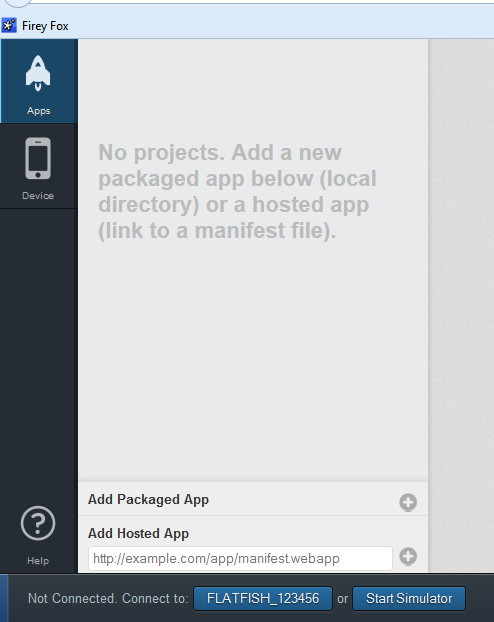

You'll notice that App Manager calls the tablet the FLATFISH_123456 but we'll use the nickname Flatfish!

I had to make one change, however, before I could load one of my own apps. When using a FxOS phone, you have to check the box allowing remote debugging. With the tablet, there isn't a check box, there is a drop-down menu and it was set to ADB. That didn't work for me. I clicked on the box and found that ADB and Devtools needed to be the option.


Then everything worked perfectly.

So I uploaded my favorite app, the revised "How Big Am I" app explained in http://firefoxosgaming.blogspot.com/2014/04/long-lost-cousin-to-responsive-design.html. I'm about to revise it again using the Viewport API, but I thought I'd see if it worked on the tablet. It does!


Here you can see that the tablet has an outer width and height of 1280x800 pixels and an inner width and height (from the notifications bar taking away 20 pixels) of 1280x780 pixels. That's HUGE!

By the way, yet another cool thing about the App Manager is that it shows you the size of the screenshot when you take it:


App Manager just is so cool!

So here's a few screen shots. First is the Home screen, showing the one app I downloaded.


The icon says FoxBall but the app is really Size Me which is version 2 of How Big Am I? The icons below (done by a better icon maker than me) are Internet, E-Mail, Gallery, Music, Contacts, and Calendar.

The second screen looks like this:


That's it. Above are Settings, Camera, Clock, Video, and the fabulous Marketplace. Below you already know. No more for now but if you add more apps, more screens will become available.

If you want to uninstall an app, you must do it through the settings.


The old way, a long press on an app until it shows a little X in the upper-left corner, is gone (too much like iOS?).

Also, if you want to see what apps are running and kill one (but not uninstall it), swipe DOWN from the top to expose the apps that are running. Kill them by pressing on the X in the upper-left corner.

To get back to the Home screen, just swipe UP! So far, most things seem the same as the phone.

I also found one setting that stopped a problem I was having. After I had been playing with the tablet a few hours, the screen started flickering and changing colors. I thought maybe the tablet was heating up and going bad and I had visions of returning it and being very sad.

But it turned out that there is a setting in the Developer section that said something about repainting. Don't select that unless you know why you want it. I unselected it and the colors went back to normal. I unselected everything except the ADB & Devtools for remote debugging and everything seems fine.

Problems

I noticed a few problems with the new tablet. The first is that several apps don't load quite right. I don't know what this is about but here's what happens. I go to load something and instead of an icon, I get a screen like this:


This was for an app called PDF Viewer, but I saw several others. It's not that big a deal because you can just carefully click on index.html and the real app will come up. But odd. Not every app did this. Something to investigate further. 

By the way, the PDF Viewer app really ran slow on the tablet, but runs fast on a phone. This probably is because there are less pixels to crunch. It took like 3 or 4 seconds to fill a page with a double-column PDF. This may be a problem for apps that have to crunch more pixels!

My other noticeable problem is that the Device Orientation does not seem to work. There is a cool app called Orbland that simulates rolling a steel ball around a wooden maze. It works on the original ZTE Open and the Geeksphone Peak, but does not work on ZTE Open C, and now does not work on the Flatfish!

I had written an app that shows the code for Device Orientation at http://firefoxosgaming.blogspot.com/2013/12/device-orientation-game-programming.html
and it works on the ZTE Open and the Geeksphone Peak (both running at version 1.2) but does not work on the ZTE Open C (version 1.3) or the Flatfish (version 1.4). The hardware has a gyroscope and the Device Orientation API should work but doesn't. I need to file a bug on this so that people can play Orbland! Seriously, device orientation is important for phones and I'll figure out what the story is. Especially because I'm working on a space shooter that uses Device Orientation to steer. By the way, my blog post on Device Orientation was the most popular post on my blog, but has now been pushed off the top of the pile by my post on the ZTE Open C.

Also, in a similar problem, the Vibration API doesn't work for the ZTE Open C or the Flatfish, but there was some discussion on B2G about how vibration isn't support in the actual devices (even though it was on the ZTE Open and the Geeksphone Peak. I wonder why those aren't supported. I like vibration for tapping on keys and of course for games it really helps explosions!

I think that covers the first round of this fabulous new tablet. It seems very well built and I'm happy to put it through its paces and write lots of posts on responsive design because now I have a phone (three actually) and a tablet. Clearly, what works on a phone won't work on a tablet. And by the way, I'm ready to say that if you write an app, have your phone version be portrait, but have your tablet version landscape. Because of the way the plug works, it's not easy to view something in portrait on the tablet.

So, stay tuned, but not iTuned or iPadded!

Thursday, May 15, 2014

ZTE Open C (Hardware Review)

Woo hoo!

I just got my ZTE Open C from eBay and I'm very happy with it. This is my third Firefox OS phone and so far it is really great. I wanted something I could try to use, as opposed to something I could program. I'll be running it through its paces, but so far I'm extremely happy with the $99 unlocked price I paid to the ZTE store on US EBay.

Why is this cool? It seems faster than the ZTE Open I have. The official Mozilla specs are at https://developer.mozilla.org/en-US/Firefox_OS/Developer_phone_guide/Phone_specs#Device_specifications. From those it looks like the specs are the same as the Geeksphone Peak, but I'm investigating that a little more.

It looks like this:


The Geeksphone Peak has this processor: Qualcomm Snapdragon S4 8225 and the ZTE Open C has this one: Qualcomm MSM8210 Snapdragon. If someone wants to tell me the difference, that would be cool. What is cool about the Open C is that it has very similar specs to the "Flame" Firefox OS reference device. Same processor, anyway.

Of course the first thing I did was to hook it up to my PC and fire up App Manager. Here are a few screen shots. Oh, I forgot to say that the Open C comes with Firefox OS 1.3 out of the box! And when I hooked it up to my 64-bit Windows 7 box, it had more drivers than the one or two the earlier phones had. Here's a snap of the drivers that Windows Update found for me.


Getting Windows Update to do all of that is downright amazing. Someone has a friend in Redmond!

So here are a few screens showing off version 1.3 of Firefox OS.

Here is the home screen:

N

Those icons at the top take you to selections of relevant apps. I don't know how they are chosen, but I'm sure people will care about them.

At the bottom you see the usual suspects: phone, address book, messages, browser, and radio.

The next screen looked like this:


The usual suspects: camera, gallery, email, calendar, twitter, facebook, settings, and marketplace.

There was a third screen:


This one had music, video, clock, notes, usage, here maps, and ... SOFTWARE UPDATE. 

If you click on that, here's what you get:


I guess ZTE learned their lesson and now there's a button on the screen to update when version 1.4 is ready to go. Thank you! After all the suffering we all did to update the original ZTE Open to anything beyond 1.0, it's nice that they're starting out at 1.3. 

One other cool thing (of many) that I just discovered is that the Notes app connects to Evernote! Very easily, too. By the way, all I had to do was drop in a spare SIM card and add a 16GB SD card, and I was ready to go. 

By the way, when I plugged it in, Windows recognized the device and showed me this:


The first drive is the 16GB SD card I put in (okay, everybody lies about memory) and the second drive is what ZTE considers as memory you can use for music, video, pictures, etc. I had a choice about which drive to use but I chose my external SD card for all my music, etc.

Here's some of the music I downloaded right away:


A prize for anyone who knows where those songs are from!

I've got plenty of room for storage:


I then ran my app that looks at inner and outer dimensions and here is what it produced:


However, alert readers will notice that those numbers don't match the numbers in the spec at Mozilla I cited at the top of this page. J. Ryan Stinnett pointed me to the article at https://developer.mozilla.org/en-US/docs/Mozilla/Mobile/Viewport_meta_tag#A_pixel_is_not_a_pixel. I will need to digest this article and see if there's some way I can make apps that use these different "pixels". My app works just fine and the ball bounces around the edges, but it sounds like if I use viewport, I can get a bigger super-pixel screen. 

So far, the ZTE Open C is definitely a winner ... especially at $99. Get yours today from http://item.ebay.com/291125433026. Right now when I went to check, it said 332 had been sold and 8 people had bought this in the last 8 hours. They're having a 5% off sale if you buy 2! In case you're worried, the seller, ZTE_US, has a 99.% rating, which is great!

I'll be trying out more apps and doing more comparisons of the ZTE Open C and the Geeksphone Peak in the next few days, so stay tuned, but not iTuned!

Wednesday, April 30, 2014

Long Lost Cousin to Responsive Design (Game Programming)

In my recent post on Responsive Design, at http://firefoxosgaming.blogspot.com/2014/04/responsive-design-game-programming.html, I noted the interesting problems with the Software Home button and how that robbed precious screen real estate from the ZTE Open. The same issues apply to other phones, but the ZTE is especially important because the screen is small.

Software Home Button

To refresh your memory, here is the ZTE Open with no Software Home button.


And here is the same ZTE Open with the Software Home button:


50 pixels lost!

André Jaenisch did some digging and discovered that this is documented on MDN.  Thank you, André!

MDN programming at https://developer.mozilla.org/en-US/Firefox_OS/Platform/Gaia/Gaia_apps/System#The_software_home_button says to use this CSS to detect and display the Software Home button:
@media not all and (-moz-physical-home-button) {
  #screen:not(.software-button-disabled) > #windows > .appWindow {
    bottom: 5rem;
  }
 }
And mentions the ability to set this in the Developer Settings here at https://developer.mozilla.org/en-US/Firefox_OS/Debugging/Developer_settings#Enable_software_home_button.

I never noticed this but somewhere when I upgraded my ZTE Open from 1.0 to 1.2, the Software Home button was enabled and I noticed it.

This button will turn out to be important when tablets for Firefox OS become available.

You don't need to worry about this, but if you want to, you can always put in that extra bit of CSS. In any case, make sure you actually detect what your screen size is and act accordingly.

Upgrading the ZTE Open to 1.3 or 1.4

By the way, if you have a ZTE Open, André also dug up some links on how to upgrade the ZTE Open to Firefox OS version 1.3 or 1.4. Again, thank you, André!

Upgrade to Firefox OS 1.3 at http://www.gizbeat.com/4223/how-to-build-firefox-os-1-3-2/.

Upgrade to Firefox OS 1.3 at http://blog.chellinsky.net/putting-firefox-os-v1-4-on-a-zte-open/.

Viewing Screen Sizes

I actually forgot to put in the code of how to generate the numbers you see in the screen shots above. Start out with the code from my latest CSS Shell code (adapt if you're using Canvas or SVG) at http://firefoxosgaming.blogspot.com/2014/03/son-of-css-shell-game-programming.html.

First I added a bit to the body to give the information a place to display:

  <h3>Width</h3>
    <p id="ow">Outer Width</p>
    <p id="iw">Inner Width</p>
  <h3>Height</h3>
    <p id="oh">Outer Height</p>
    <p id="ih">Inner Height</p>

Then I added this code in the section that runs after the page is loaded:

      // Get height and width.
      ow.textContent =
        "Outer Width = " + window.outerWidth;
      iw.textContent =
        "Inner Width = " + window.innerWidth;
      oh.textContent =
        "Outer Height = " + window.outerHeight;
      ih.textContent =
        "Inner Height = " + window.innerHeight;


You can also put this into console.log format. The important thing is that you know the inner and outer width and height, so you can program accordingly, but in this case, also display it so you can see what you are dealing with when looking at various devices.

Thursday, March 20, 2014

Son of CSS Shell (Game Programming)

As I get further into programming for Firefox OS, I find that I want to go back to basics from time to time. One of my favorite things is to create a shell that can be used to build games on top of. A simple run of code that has all the basics in place. Taking what I've learned, I've created a new shell for you to use for CSS games. When I say CSS games, I am thinking of what some people call CSS sprites. Essentially you move images around on the screen by taking advantage of basic properties of HTML5, CSS, and JavaScript. Not CSS3, mind you, which has become a huge ball of stuff that looks cool but doesn't hang together quite yet.

So here is what I recommend for starting out with CSS sprites. You can read more about those at these earlier posts:

Bouncing a Ball in CSS
http://firefoxosgaming.blogspot.com/2013/10/bouncing-ball-in-css-game-programming.html

Earlier CSS Shell
http://firefoxosgaming.blogspot.com/2013/11/css-shell-game-programming.html

CSS Collision Detection
http://firefoxosgaming.blogspot.com/2013/11/css-detecting-collisions-game.html

The shell has a simple bouncing ball, which is easy to see how it works, but just as easy to remove the bouncing ball part and add your own type of game.

Screen Shots

So, here's what this shell looks like, running on the ZTE Open.


Next, here is the same game running in the App Manager simulator.


And, finally, here's what it looks like in the nightly Firefox desktop browser with the debugger open and resized to a smaller-than-normal size.


The last is pretty useful if you want to instantly simulate different screen sizes and look at the debugging information. The screen is only 343x237, but the ball bounces just fine against the four edges but doesn't enter the debugger space.

The Code

Here is the code:

<!DOCTYPE HTML>
<html>
<head>
  <meta charset="UTF-8">
  <title>
    New CSS Shell
  </title>

  <style>
     
    #ball
    {
      width: 20px;
      height: 20px;
      position: absolute;
      top: 200px;
      left: 100px;
      background-image: url(ball.png);
    }

  </style>

  <div id="ball"></div>   

  <script>

    // Global variables   
    var boardWidth = window.innerWidth;
    var boardHeight = window.innerHeight;   
    var ballHor = boardWidth / 2;
    var ballVer = boardHeight /2;    
    var changeHor = 10;
    var changeVer = 10;
   
    // Log initial board height & width.
    console.log("Board width = "
      + boardWidth);
    console.log("Board height = "
      + boardHeight);
  
    // requestAnimationFrame variations
    var requestAnimationFrame =
    window.requestAnimationFrame ||
    window.mozRequestAnimationFrame ||
    window.webkitRequestAnimationFrame ||
    window.msRequestAnimationFrame;
   
    document.documentElement.
      style.overflow = 'hidden';
  
    // Load event listener
    window.addEventListener("load",
      getLoaded, false);
     
    // Resize event listener
    window.addEventListener("resize",
      resizeMe, false);

    // Get ball information.
    var myBall =
      document.querySelector("#ball");
  
    // Function called on page load.
    function getLoaded() {
   
      // Lock screen orientation to portrait.
      // Uses "moz" prefix.
      window.screen.
        mozLockOrientation("portrait"); 
      console.log("Locked to portrait");
     
      // Background color
      document.body.style.
        backgroundColor = "Peru";
  
      // Start game loop.
      gameLoop();   
      
      // Page loaded message
      console.log("The page is loaded.");
     

      }
  
    // Game loop
    function gameLoop() {
  
      // Repeat game loop infinitely.
      requestAnimationFrame(gameLoop);
  
      // Move the ball once.
      ballMove();      
      }
  

    // Calculate and move the ball. 
    function ballMove() {
  
      // Changes are calculated but do not
      // take effect until next time.     
      myBall.style.left = ballHor + "px";
      myBall.style.top = ballVer + "px";
      
      // Calculate new vertical component.
      ballVer = ballVer + changeVer;

      // Top hit, reverse direction.
      if (ballVer + changeVer < -10)
        changeVer = -changeVer;
    
      // Bottom hit, reverse direction.
      if (ballVer + changeVer >
        boardHeight - 10)
          changeVer = -changeVer;

      // Calculate new horizontal component.
      ballHor = ballHor + changeHor;

      // Left edge hit, reverse direction.
      if (ballHor + changeHor < -10)
        changeHor = -changeHor;
    
      // Right edge hit, reverse direction.
      if (ballHor + changeHor >
        boardWidth - 10)
          changeHor = -changeHor;
    }

    // Testing in desktop browser only.
    // Changes board size to match new.
    function resizeMe() {
     
      //Change board size.
      boardWidth = window.innerWidth;
      boardHeight = window.innerHeight;  
     
      // Log initial board height & width.
      console.log("Board width = "
        + boardWidth);
      console.log("Board height = "
        + boardHeight);
    }
   
  </script>
</head>

<body>
  <footer>
    <small>
      Copyright &copy; 2014 Bob Thulfram
    </small>
  </footer>
</body>
</html>


What I Have Added

After thinking about it over the past few weeks, here are a few things I've added:
  1. Screen Orientation. The game plays best in portrait mode.
  2. Responsive Design. The game should play on any size phone or tablet.
  3. More Responsive Design. I wanted to test how this looks in browsers on desktops.
  4. I wanted to add a copyright notice in the code.
  5. I felt like a background color helps the screen shot stand out in a blog post. 

Screen Orientation

I've written about Screen Orientation for Firefox OS at http://firefoxosgaming.blogspot.com/2013/11/screen-orientation-and-moz-prefixes.html. And it works! Of course, you need to test this on a real phone. When I tilt the phone with my code, the screen doesn't tilt, it stays oriented in portrait.

However, this doesn't seem to work on the App Manager simulator. There's a little button next to the home button at the bottom that looks like two folders overlapping. Click on that and the screen turns sideways. But it shouldn't! This might be a bug or it might be that this isn't supported yet in the simulator. But it works fine on a phone!

Here's the code:

      window.screen.
        mozLockOrientation("portrait"); 
      console.log("Locked to portrait");


Note that this needs the "moz" prefix for now.

Responsive Design

One thing that I've noticed on a lot of the games I've reviewed is that they don't look the same on different phones. The ZTE Open and the Geeksphone Peak have different sizes! But you want to design your game so it works on any size phone, tablet, or whatever. Maybe not watches, though.

So what I'm doing with this code is to get the actual screen size and make that the size of my game board. I wrote about this in an early topics called How Big A I? at http://firefoxosgaming.blogspot.com/2013/10/how-big-am-i-game-programming.html.

And here is how I implement it. These lines set up the game board to match the actual screen. Instead of a fixed value, I created board size by seeing what the actual screen size is. This is in the global variable section.

    var boardWidth = window.innerWidth;
    var boardHeight = window.innerHeight;   


I also added this to make sure what actually happens:

    console.log("Board width = "
      + boardWidth);
    console.log("Board height = "
      + boardHeight);


It's always a good idea to track what is happening, especially when testing different sized phones.

Really Responsive Design

I often run my code first in the latest Firefox nightly browser. I recommend this, even though you need to be careful because not everything in the desktop browser is in Firefox OS! But it makes the easy development cycle even easier and you can save the phone-specific parts for testing on an actual phone (like Screen Orientation).

I thought it would be fun to resize the browser so I can just drag it to see it small or large. And it is also easy to see the debugged output on a desktop browser.

So I added this code to handle the event of the browser being resized.

    // Resize event listener
    window.addEventListener("resize",
      resizeMe, false);


This will call the function resizeMe every time the browser is resized. I also added this code to prevent the scroll bars from trying to display when the ball bounces into the edge.

    document.documentElement.
      style.overflow = 'hidden';


And here's the function that is called when the window is resized.

    function resizeMe() {
     
      //Change board size.
      boardWidth = window.innerWidth;
      boardHeight = window.innerHeight;  
     
      // Log initial board height & width.
      console.log("Board width = "
        + boardWidth);
      console.log("Board height = "
        + boardHeight);
    }


This is the same code as was used in the global variables, but you need to call it again when the window is resized. And I like outputting the new width and height of the board so I can see what is going on. The third screen shot above shows this working beautifully.

Copyright

Not everyone cares, but I care about copyright. I'm happy to have you use my code in your own games, but I'd like to keep control over how it is published and where it appears. This doesn't have a standard yet, but a growing convention is to use the HTML5 tag small inside a footer tag. So I've added this to the code at the very end, the only thing that is in the actual body of the code.

  <footer>
    <small>
      Copyright &copy; 2014 Bob Thulfram
    </small>
  </footer>


The &copy; will produce a copyright symbol (c).

Background Color

I've used this before here and there, so here it is again.

      document.body.style.
        backgroundColor = "Peru";


I picked the color Peru for no particular reason except that's a nice country! Get your color names at https://developer.mozilla.org/en-US/docs/Web/CSS/color_value. When I did this, I realized that my bouncing ball PNG image had a white background, which didn't look good, so I had to redraw it by filling in all the white bits with Peru color. Which the MDN page will happily tell you is rgb(205, 133,  63). What this means is that the red, green, and blue percents are those three numbers. I plugged those numbers into Paint Shop Pro and the PNG now looks like this, in all its pixel-y greatness.


Wrapping Up

So this is the shell I will be using to create new CSS game bits and I recommend you use the parts you want. I'll do the same for Canvas and CSS but I might do some cool CSS stuff sooner, and there's games to review, and, and, and!


Friday, January 17, 2014

APC Rock (Hardware Review)

I'll add more bits about this as I discover more, but the Fox has landed!


I had a little trouble yesterday because all I had was a VGA cable, but today I managed to find a HDMI to DVI and when I turned it on, the above screen appeared. It's the Firefox OS lock screen for PC. (Don't know if that's the official name.)

Swipe with your mouse to get this:


And again for the next screen.

How cool is that? The picture is a little fuzzy because I took it with my Geeksphone Peak.

I don't know how to take screen shots or even load an app on to this and I don't have WiFi hooked up, but the Fox has defnitely landed!

And a bargain at $59 US. Their site says $79 but that's a mistake. They answer email! And the shipping was fast (and I think maybe another $25 from Taiwan to the Seattle). Who are they? Why, this wonderful device is called the ASR Rock and it is made by the folks at VIA. I've known about VIA for several years and have a few computers made by them. Their specialty (among others) is making x86 Intel-compatible chips. The computers I had were about the size of a hardcover book and they sell this board for $99 with a book-like enclosure.

If you want to know more, check out http://apc.io/products/rock/. Essentially this is a single-board computer that is about the size of a phone. It comes with a power supply and not much else. But it does come with Firefox OS and a metal shield to fit inside a computer case. The board is compatible with the Neo-ITX form factor, which  is compatible with Mini-ITX and MicroATX. (That's geek for small form factor cases.) The board is bigger than a Raspberry Pi but very similar in concept except it boots Firefox OS! All I did was plug in the power, plug in the HDMI, plug in a USB keyboard and mouse, and I now have a Firefox OS PC and two Firefox OS Phones (ZTE Open and Geeksphone Peak).

This Changes Everything

A few days ago, Andre Jaenisch wanted to know why I was using absolute positioning when this isn't considered (by many) to be a best practice. I'm so used to doing this that I needed to think more about this.

Absolute positioning was needed the way I was using text elements mixed with SVG. One of the fundamental issues of writing games in a browser is that you have to be very aware of the display flow of the elements in a browser. Usually what you type is what you get, but once you start calculating and mixing different kinds of elements, you have to be careful. In that example, I had put the text in the body and then the SVG in the JavaScript code. It looked great in the desktop browser, but on the phone the bottom half of the SVG pane was cut off. The Head and Paragraph elements had pushed it down!

The answer was to take the text elements out of the browser flow and slap them down on top of the SVG pane, which was meant to take up the whole phone screen. So that's why I did it there, but now my head is spinning, realizing that the game is changing.

When I started a few months ago, it looked like the phone would be the main outlet for Firefox OS, and the screen size was the same for the first few phones. So I targeted that, never dreaming that those speedy Firefox boys and girls were working day and night behind the scenes to bring more goodies.

So now the Firefox OS PC (is it a PC? The chip is VIA ARM (no Intel here) but it can fit in a PC box and use PC peripherals. How soon will I be writing my blog on that?

And just last week the Firefox OS tablet was announced and the first tablets are now being tossed around at Firefox towers in the UK, courtesy of Foxconn (is this the beginning of the Fox conspiracy?)

What next? Laptops? FoxBooks? FoxWatches? Where's my Fox Toothbrush?

Anyway, Andre, I'll now think about making responsive games. Right now I'm concerned with making very simple games that show basic principles, so I don't want to add any extra of anything. I'm not teaching computer science, I'm showing how to make some games for Firefox OS. Same reason I use globals -- they make the code more efficient for small games. But in a big game with many screens, globals might not be a good idea, and name spaces are very important (SVG uses namespaces).

But now I am thinking about it. A game like PaddleFox would be easy to adapt, but an RPG might be more difficult. Responsive design is growing very fast and SVG can be part of it. But there's an even newer slant called adaptive design that is somewhat similar but instead of just changing the width and height, it displays different information depending on the device. So your watch gets one set of data and your Firefox OS PC gets another. Something to think about.

Now to get back to getting the wireless running on my APC Rock!